Last week I spoke at Communitelligence’s “Rethinking Corporate Communications 2009” conference just two days after the GrowSmartBiz conference. GSB was a veritable smorgasbord of networking and ideas, with Steven Fisher’s presentation on killer business cards definitely a highlight.
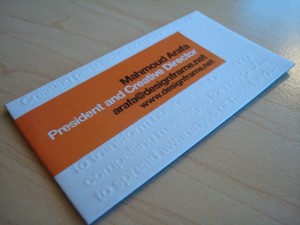
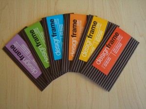
So when I met Mahmoud Arafa of designframe at RCC and saw his business cards, I couldn’t but help think of Steve’s presentation. Check them out.
And this is the back.

The idea is that having a choice of cards for someone to pick from is a conversation starter, which will make his firm stand out from the crowd. I liked the use of colors, textures and fonts, so I asked Mahmoud to tell me more about his cards.
How did you come up with the idea for your business cards?
Your business card and website are extremely important for your business. It’s part of your persona and who you are. People judge you from your business card and website. It’s the calling card to start a connection.
Our aim was to design stationery that meets the following goals:
- Raises curiosity, so the recipient asks questions and start a friendly conversation
- Stands out and challenges clichés
- Says something about what we do
- Reflects diversity (in the type of industries we serve and the cultures we come from)
- Sends a message to our clients that you can have many colors in your identity while maintaing a strong distinguished visual identity.
The cards come in six colors, and Mahmoud says they’re all equally popular.
So does the color a person picks tell you something about him or her?
That’s the hidden tactic, sometimes colors say something about the card recipient. [This is what I’ve seen] from personal experience:
- Blue: Conservative, more on the corporate side of life
- Green: Nature lover, cares about the environment, and his/her health
- Orange: Vibrant and energetic
- Yellow: Sometimes happiness and sometimes indecisiveness!
- Red: Passionate and strong character
- Purple: Mysterious person
Are there any colors your business cards don’t come in?
Yeah, there are more than 24 million colors out there we used only six! Actually that was purely for aesthetic reasons since we wanted to use colors that can work with our earthy brown.
Has this approach to your business cards resulted in more business development meetings for you and, ultimately, more business?
Absolutely. As the business cards create interest, they also trigger people to check our website. So when I follow up with them, they [are] familiar with what we do; then I take it a step further and [ask] them for a meeting.
I collect a fair share of business cards, as I suspect you do. In most cases, I’d be hard-pressed to connect a face with a card if I’ve just met them fleetingly (again, as I suspect you would). I’m not going to forget Mahmoud in a while, though. All because of a clever use of paper and color that are doing exactly what business cards are meant to do – open a door for you that will, ultimately, grow business.
With so much noise out there, this is an interesting approach, don’t you think? What steps do you take to make your business stand out from the crowd? Have they worked? I’d love to know. And if you’d like to learn more about Mahmoud’s work, just visit his site.


@ExtremelyAvg Awesome! You’re going to send me one, right?
I have considered getting some cards which look like the cover of my novel. This inspired me to actually get it done.
Great Info! Thanks for the post!
Great post and great business cards. He doesn’t break any of the rules in my presentation. He uses the colors not as a gimmick and that fact that I can write on it and he tells me what he does quickly makes it a business card I would definitely keep.
-Steve
Thanks, Steve. Much better than the meat card, eh? ;-)
Hi Shonali,
great post. i hope I gave you my business card because following Raj’s idea above I have my info on the front and cartoon at the back :) i.e a photo of myself LOL. Jokes apart you can buy busines cards with Hugh Macleod’s drawings at the back http://gapingvoid.streetcards.com/
Cheers !
Shashi
Shashi, did you get that idea from Raj, or vice versa? ;-) I love the Hugh Macleod link, thanks so much. I don’t have your business card, btw – you need to give it to me!
Love the post. I think biz cards these days leave people in the weeds. Instead people should keep them simple but at the same time try to wow them with one thing about the card so you stand out. One other idea I have seen is put your basic business details on the front and have a funny little cartoon on the back. If you make someone laugh, they have more of a chance of remembering you!
Great cards. I love how they are white on the back for taking down notes about your exchange. Very cool!
Yup, I think that’s a really good idea. It’s also really interesting to see the contrast between the two sides from a visual point of view, I think. Thanks for stopping by.