There’s a line in the chorus of Nicki Minaj’s song “Starships,” where she sings “hands up and touch the sky.”
I know this for two reasons:
#1 because it’s on the radio all the time, and
#2 because everytime Nicki Minaj sings that line my three-year-old dutifully throws her hands up. In fact if I don’t at least throw one obligatory hand up – she yells at me. “Hands up, Dad! HANDS UP!”
It occurred to me that some people treat infographics like my three-year old treats “Starships.”
If there are beautifully presented pictures, the information informing them is rarely questioned, just as my daughter dutifully obliges any call for raised hands.
One recent infographic illustrated this point quite well. It was a generated by Boticca.com, describing the buying behaviors of customers referred from Pinterest and Facebook. They had a large sample size (100,000) and made some very bold assertions about an increased value of Pinterest versus Facebook for ecommerce.
The problem with this is that this is simply one case study. While 100,000 people surveyed is impressive, repeating the same action 100,000 times proves the validity of an action in a single circumstance, and not it’s applicability to any other situation.
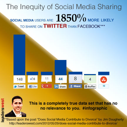
Consider this infographic that I created.
It shows that there is a much higher amount of sharing being done on Twitter than on Facebook.
What I’ve shown are simply the results for one post, but if I did a survey of 50,000 posts, the numbers would be equally disparate.
What isn’t reflected in those numbers is that I am part of the Triberr community, which allows bloggers to cross-promote each others’ posts on Twitter.
I also spend more time on Twitter than on any other social network, so even though the data supporting the infographic is limited to the results of one post, if I replicated it 100,000 times, it would continue to return similar results.
If you take a recent post on Erin Feldman’s blog (Erin is a frequent contributor to Waxing UnLyrical), the percentage of shares from Facebook and Google Plus are equal to each other, with Twitter as a smaller proportion of the whole than share of my posts.
Does this negate what I say is true about my blog? No. What it says is: what’s true for my apples isn’t true for Erin’s oranges.
What do we understand about the Bottica results?
We understand that they have a presence on Facebook and a presence on Pinterest.
We understand that based upon the customers referred from either platform, they get better results from Pinterest.
But what conclusion should we draw about Pinterest’s value versus Facebook’s? Simply that Bottica has more success with one versus the other.
Anyone who makes the leap in logic to try and apply Bottica’s results to anything except Bottica’s sites is a little irresponsible. Anyone who believes those assertions is a little gullible.
How do you like those apples? (Just don’t try to apply them to your oranges.)








[…] upon the audience. Data has to be memorable. It can’t be a slew of numbers or factoids. It has to have a context. It has to have a story. It has to have an application to the […]
[…] wrote a post for Waxing Unlyrical recently discussing our propensity to believe infographics without questioning their data. […]
@leaderswest You’re welcome. :)
@leaderswest You’re welcome! @shonali
@leaderswest Clever post. Good Will Hunting is my favorite movie. I liked them apples. @shonali
@danielnewmanuv Thanks so much for sharing @leaderswest guest post!
[…] How Do You Like Them (Infographic) Apples? (waxingunlyrical.com) […]
Infographics !! – the only thing that comes to my mind is that it’s a great way to present information in a pretty decked up way :p, however, at times I struggle to understand what the author is really trying to convey. It is so much better to have a write up giving explanation about what is that inforgraphic trying to say :)
@Ancita Thanks! I confess to being the worst writer so your point about my pointlessness is well taken. What I meant to communicate is that the data behind such graphics should be sound. I think when information is presented so professionally people are less skeptical of the information. I don’t think an infographic needs to have a write up but there should be good information informing the pictures. Cheers!
@wittlake I know, wasn’t that hilarious? When @leaderswest sent it to me, I just ROFLd bigtime!
@shonali I’ve wondered about creating an infographic about what is wrong with infographics. But my graphic skills fall short…
@wittlake Ironically, I was pitched on custom infographic software the same day I finished editing @leaderswest post…!
@shonali Infographic software? This infographic craze has gone too far… Does it include a random statistic generator?
@wittlake LOL! I don’t know. I want to check it out, though, before passing judgement.
@shonali Well, share your final opinion!
@wittlake i will!
@wittlake @shonali We like to think the infogaphic craze has only just begun ;)
@theredheadriter @arkarthick Thanks so much for sharing!
@shonali you’re welcome. :) @theredheadriter
@shonali You’re welcome!
@frank_strong Thank you, Frank!
@rocktique @arkarthick @bigdotmedia Thanks so much for sharing @leaderswest guest #WUL post.
you’re welcome @shonali :) @rocktique @bigdotmedia @leaderswest
@RockTique hi babe
Hands up! Love this, Jim > RT @leaderswest …Like Them (Infographic) Apples? http://t.co/4986eJjl #design #learning #KM #socbiz #social
@leaderswest I LOVED them apples. :)
@shonali @leaderswest lol!
@mdbarber LOL. Thank you for stopping by, and for sharing @leaderswest #WUL guest post!
@ginidietrich wait… what are you asking?
@JustInTheSouth afternoon sir, how is your summer shaping up?
@adriandayton it is crazy right now… how is yours?
@JustInTheSouth June is insane, I get to breathe some in July though…
@JustInTheSouth THEM apples!
@kmueller62 Thanks so much for sharing @leaderswest #WUL post!
@sedalr7 Thanks so much for sharing @leaderswest guest #WUL post!
@mmangen Thanks so much for sharing @leaderswest guest post.
@shonali @leaderswest Of course! Sharing is caring :)
@mmangen I LOVE your new profile photo Michelle!! @shonali
@leaderswest thank you! It was time for an update :-)
Infographics, IMO, are the latest shiny new thing that will likely fade away soon, in part for the reason you’ve listed above. They aren’t always accurate. You can make anything into a good stat if you try hard enough, and producing inaccurate statistics makes us all look silly.
But my pet peeve about many infographics is their preponderance of data and tiny type. I’ll admit to being of an age where I need glasses to read my computer screen but have, lately, stopped looking at infographics where I need to squint to read them. An infographic — or a graphic with information — is a great idea but let’s agree that we can make them cleaner and simpler so they might be even more effective for the reader. The entire “kitchen sink” doesn’t need to be included in each one.
@mdbarber Infographics often do use small type! I hate it, too. It just makes me wonder what information is trying to be hidden. Isn’t that why we joke that we should read the fine print? Infographics should be used in conjunction with the actual report, and they should have context.
@Erin F. I completely agree. I’ve gotten so that if I can’t read them easily I just trash them…but OMG what might I be missing. :-)
@mdbarber I’m tempted to create an infographic about infographics. All the small print will be some sort of sarcastic or funny remark about infographics.
Hmm. Maybe Sarah and Sheldon need to have a take on infographics. Cartoon idea! :D
@Erin F. Both are great ideas!
@ErinMFeldman – Infographics on infographics – YES! I cannot wait.@mdbarber
OMG @leaderswest you are singing my song. No I have no clue about Nick Minja. But I trash infographics with false data all the time. People and media publish them without checking facts. I busted AdWeek with one on mobile last summer with so many false things they should be ashamed. And my recent blogpost calling out an AgAge 150 blogger for not caring (and telling me I shouldnt care) that his twitter infographic says 175million tweets per day and 33 billion tweets per day!
Social Media is not formulaic like other business functions. Even advertising is formulaic in many areas. But social media rarely does success for one brand mean another can do the exact same thing.
I like real world stuff. When I see the Huffington Post has 40mil readers a month and I know headline news should get hundreds of thousands of views and I see they get 350 Like Shares it means no one is sharing. But there could be an infographic that says their study showed only 50 shares out of 500,000 views for G+ and 350 for facebook. So Facebook has 700% more shares. But reality says both are still zero LOL.
Cheers!
@HowieSPM Ha! It’s a good song! Great points all Howie – it really makes the sound research and data stand out when people are so haphazard to jump to conclusions. Now if you’ll excuse me, I have a lot of Tweeting to do if I’m going to make a dent in that 33 billion per day!
@ErinMFeldman What? Because I compared you to an orange? Low blow, Feldman. Low blow. ;)
@leaderswest Haha! Well, you did say that comparing your blog to my blog would be like comparing apples to oranges…
Look at you, being all popular! Waxing UnLyrical, Spin Sucks…
I like the idea of infographics – it’s a great way to illustrate information – but I feel as though all infographics should have disclaimers. People see them and think they’re the truth. Infographics may be truthful within certain parameters and under specific conditions, but they aren’t universal truths. It’s also good to remember that infographics are created by graphic designers. Those designers are trying to highlight certain information and to make a compelling case. The “truth” often matters little when in that world.
Thanks for mentioning me in your post. :)
@Erin F. I think you would make extraordinary infographics – I think you and @shonali could rock a side business as much as you two collaborate! You make a good point about the designer having a point of view, and it’s kind of comical to read the articles people write around them making even further leaps in logic. And you’re very welcome for the mention, though I was under the impression it was a requirement for submission? ;)
@ShakirahDawud Shakirah, quite honored for you to take the time to read and comment (and of course I am grateful to shonali for the opportunity to write a post for WUL. The company presented this information in a way that invited a leap in logic, but it’s shocking how many writers take the full leap and suggest that what amounts to a case study should be applicable to all. Thanks again for your support and your comment!
I appreciate the point you make here, Jim. Most people tend to cast aspersions on the data itself or on the way it’s displayed, or how the data’s skewed… none of that really made me go “aha!” the way this has. People are conducting experiments like these in environments that can’t be replicated by anyone else, and that’s been completely overlooked by most of us. Thank you.