 This is part of the Blogging for Grasshoppers series
Judging a book by its cover
As I’ve been trying to pay more attention to writing more often, writing well more often, and sharing more good writing,
I’ve been thinking a lot about writing.
D’oh, you say.
It’s not just thinking about writing that I’ve been engaging in.
Image: mj*laflaca via Flickr, Creative Commons
It’s about how that writing looks.
Because when you live in a world as fast-paced as ours, you just have a few seconds while your potential reader is skimming through her email, or RSS reader, or website, and decides whether or not to click through and read the fully story… or move on.
It’s the Google generation’s way of thinking.
In other words, while your content might be fabulous in its essence, your reader is doing exactly what we grew up being told not to do: judge a book by its cover.
In the digital world, that’s judging content by its ability to intrigue you in a split-second.
As you continue to hone your craft (as I try to do), here are some of the exercises I put my writing (and those of my guest bloggers) through on a daily basis, to see if it looks as attractively as it (I think) reads.
They might be helpful to you as you continue on your path as a blogging Grasshopper.
1. Preview before you publish.
WordPress has a great preview function, where you can see exactly how your post will appear… before it publishes.
This is hugely helpful, because each theme is different and, as a result, the way a post looks when published on one blog, might look completely different on another.
So hit that “preview” button over and over again (don’t forget to save your posts as you’re writing) until you’re satisfied with how easy your post is to read, from a visual point of view.
2. Pull out the bag of tricks.
As a regular reader, you’ll have noticed that I’ve started making frequent use of tools in the WordPress platform such as block quotes and different forms of emphasis via bolding or italicizing different bits of copy.
I also often spread out text over different lines even if they’re not technically sentences.
Simply
because
it helps to break up the monotony of the written line, and often adds a visual element to the point you’re trying to make.
And especially if you have a theme where the font size is fairly, shall we say, petite, it helps immensely.
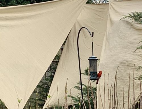
3. An image speaks a thousand words.
 You’ll have noticed that I love using images to illustrate a post.
Image: U.S. Army via Flickr, Creative Commons
Usually these are placed at the top of a post, but often, if a post is long, I’ll insert additional images, alternating left- and right-aligning them.
This helps to add a visual element to a post, much as those grouped pages of photos do, here and there, in an interminably long autobiography.
Not that your posts are interminably long. Just saying…
I really started thinking actively about things like this after attending a writing workshop by the oh-so-fabulous Ann Wylie (you really should sign up, if she’s teaching anywhere near you).
And if you look at my posts pre- and post-June 30, 2010, you’ll see the difference.
But hey, it’s never too late to start, right?
Additional resources:
The Poynter Institute has a great article on writing for the web
7 ways to improve your writing… right now, from Copyblogger (bet you’ve already read this, right?)
Ann Wylie gives you some funny formulas to spice up your writing
![[EVENT]: PR Hacks for Small Biz (online)](https://shonaliburke.com/wp-content/uploads/2021/06/FB-Ad-1200x800-01-01-01-Copy-500x383.jpeg)


@Mywritingworld This particular post was shared via the “Tweet old posts” plugin, which is a neat way to share older posts (as the name suggests :)). When I set it up, I went through all my posts and unselected those that were time-sensitive… but some early posts are still relevant (as I think this one is). Glad you liked the image!
Why such an old post, not a new one ? I like the main image on this post, the eye on the hand.
[…] or judging a blog post by its cover. […]
[…] a right or wrong answer to this question. If, as Ingrid puts it, long posts are visually appealing (very important for readability) and interesting, you’re more likely to read […]
[…] it’s not just what you read, it’s how what you read looks that could entice you to hang around, chat a while… and maybe […]
Hey Shonali – Thx for this. Really like your reminder of photos to anchor the post visually. On that note, diversifying media can add appeal too, like adding mini video or audio casts. Conducting interviews via Flip video cams or a smart phone’s audio memo device can be strong sources of social content. Platforms with mobile interfaces like Posterous can be quick easy ways to mobile blog.
Hope that doesn’t sound preachy! …I just get kicks out of mobile blogging w/ multimedia.
Videos/audio are great to use, Jill. You don’t sound preachy at all; I guess when I wrote this post I was thinking more of the “static” things one could look at to evaluate the post’s visual appeal, if that makes sense?
Alexandra stole my idea. I
was
going
to
demonstrate your post but she already did it.
Seriously, I really like this. It’s a great reminder that we need to pay attention to how our posts LOOK and not just how they SOUND.
LOL, the Alexandra and Mary competition. :) Thanks so much, Mary!
I have definitely noticed how visually appealing your posts are – your use of pictures, boxes, bold & italics DO draw me in. Now
if only I
could be as CLEVER
as YOU!!!
Great post. I bookmarked it to save as reference.
You made me laugh, Alexandra! Thanks so much – and for what it’s worth, your posts on Fun and Fit are so hilarious I usually don’t have the time to think about how they look, they start cracking me up almost as soon as I’ve read the first sentence!
Great post, Shonali. I couldn’t live without the Preview button! That thing gets a workout as I write.
I also think it’s much easier to proof your post in preview mode. I have an easier time spotting spelling and grammatical mistakes when I see the copy in a different font with different line breaks.
Thinking of trying more photos…
That’s a really good point about proofing in Preview, Ann. I couldn’t live without that. I’ve also found it’s much easier to write in the “full screen” mode, don’t you?
[…] This post was mentioned on Twitter by Gautam Ghosh, Gio Dirosso. Gio Dirosso said: Judging A Blog Post By Its Cover | Waxing UnLyrical: In the digital world, that's judging content by its ability… http://bit.ly/9LSOxg […]