 This is part of the Blogging for Grasshopper series
This post isn’t about adding visuals or video into your WordPress blog,
or using Cincopa,
or judging a blog post by its cover.
It’s about something I never thought I could do… and when I realized I could, well, of course I had to share it with you.
You know by now that I don’t consider myself a “techie.”
In fact, there’s nothing that will get me screaming “Cor Blimey!” (do you like that, Gini Dietrich?) or running for the hills as if you were to ask me to do something tech-related.
Because, you know, those techie people know all about stuff like HTML and CSS and coding and Ruby on Rails and…
I don’t.
Aargh! My head hurts already!
This, however, is something I figured out yesterday, with a little help from the almighty Google… and spurred on by Marcus Sheridan, aka The Sales Lion.
Marcus was looking at Conway Wigg‘s most recent guest post (great take on how texting may/may not impact language as we know it), and emailed me – in a very nice way – to let me know that the font on WUL was…
… how shall I put it…
a wee bit unreadable.
Just a wee bit.
Wee.
(Get it?)
Now, this is something I’ve been grappling with myself. But there’s only so much a non-techie can do within the limitations of the (free) WordPress theme said non-techie uses, so I’ve been trying to live with it until I can do an overhaul.
However, after Marcus and I started emailing, I said to myself, “Maybe I can figure out how to do this.”
After all, that’s what a grasshopper would say, right?
So I turned to the almighty Google (did I already say that?) to see what I could find about even dummies being able to change the font size on one’s WordPress blog.
It’s actually pretty easy!
I found a couple of different posts that were very useful, including one video that was not, because it dealt with a WordPress plugin, and the guy who made it didn’t know half of what the plugin could do.
Why make the video, then?
But I digress.
Here are the posts I found very helpful, so I suggest you file them away for future reference:
- How to change the fonts on your WordPress blog theme, from Blogtap;
- A great overview on setting the size of type in CSS from CSS – Tricks; and
- This WordPress forum discussion on increasing font size for your comments display.
For the moment, the main thing I needed to do was increase the font size of the posts just a bit.
I mean, if I – with reading glasses (sometimes) – and Marcus – without reading glasses – find it a little too small for comfort…
… then it is a little too small for comfort.
But it was pretty easy to update. Here’s what I did (and why I said this is a two-step process, because it literally is).
1. Go to your CSS stylesheet in your Editor, and then find where it says Stylesheet (style.css) on the right-hand side.
These are Clicks 1 (getting to the Editor) and 2 (getting to the stylesheet), for those of you out there who are literal-minded.
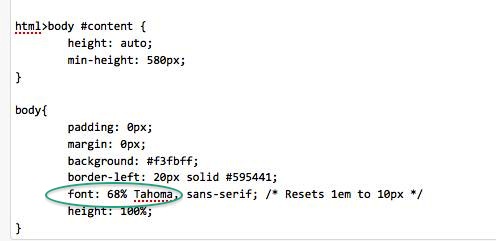
2. Find the bit of code that contains the style for the “body” tag.
Basically, this means that whatever you set here as the “style” will be applied throughout your WP blog.
I did this by searching for “body {” and then for “body{” (without the quotes). I found it towards the top of my stylesheet.
3. Change the % value of your chosen font, like so.
Now, I thought about resizing the em value, etc., as the great “CSS – Tricks” post I pointed you to earlier explained.
But that was too tough for my little head.
Also, it says, and I quote:
The most popular method in working with em values is to set the font-size on the body to 62.5%. Because the default browser font-size is 16px, this makes it 10px (without hard-setting it to 10px, which wouldn’t cascade).
Using 10 as a multiplier is much easier than using 16. This way, you need a font size of 18px? Use font-size: 1.8em.
Now, I noticed that my font was indeed set to a default of 62.5%.
So, I thought, instead of playing with, and trying to figure out exactly where I would have to change, the “em” value, why not just change the % value of the font?
So that’s what I did (after carefully noting exactly where and what it was, in case I broke anything).
Wallah!
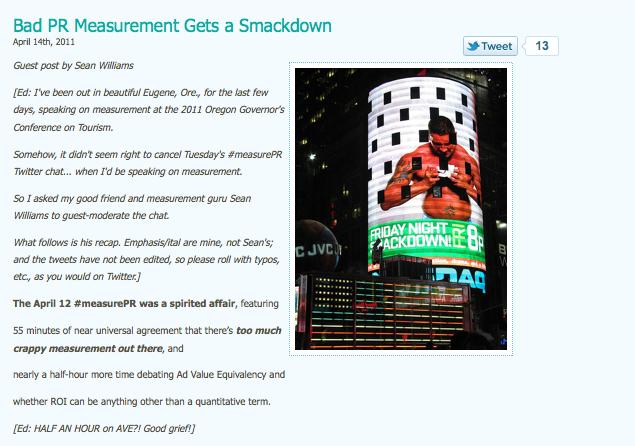
See what WUL looks like with a 50% font size:
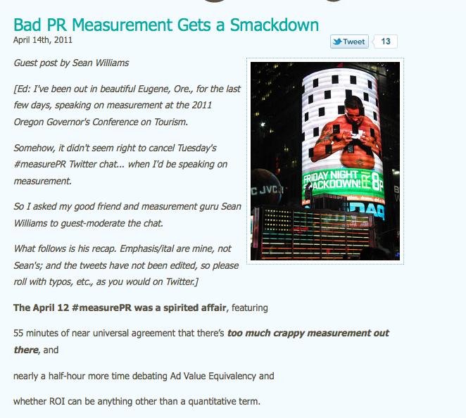
And see what it looks like with a 68% font size (which is what you’re reading right now):
See the difference?
Once you’ve found the font size that works for you, hit “update file” in your CSS stylesheet.
This is Click 3.
So far, at least, I don’t seem to have broken anything.
So with one-two-three clicks, you’re done!
What do you think?
Is this a better font size for WUL? Would you prefer another? 70%? 75%? (Believe me, that will be too big…)
Please let me know, ‘cos if you ain’t readin’, there ain’t no point in us writin’…
Image: dieselbug2007 via Flickr, CC 2.0





![Social Media: The Key to Transforming Doctor-Patient Communication [Redux]](https://shonaliburke.com/wp-content/uploads/2013/07/2478514667_c11f906e33_b-300x225-500x383.jpg)
[…] feedback from Marcus Sheridan (when I didn’t even know him) that led to me figuring out how to increase the font size here on WUL. Community conversations led to one of my favorite posts yet (and, I think, yours) on […]
@bdorman264 Aw, that was such a nice thing to say. Every time I have to pull my reading glasses out (which I only started needing last year, what do they say about turning 40…), I felt like such an old woman!
The thing with your blog is that the font is very readable. Right from the start, this particular theme (Bluebird), had a much smaller default font. Along the way, I managed to get help from iherwin (one of my awesome regular guest bloggers who’s disappeared for a bit, cough cough) to make some changes to this one. But he’s been busy lately, and I’m terrified – TERRIFIED – of breaking some HTML/CSS crap – so I was holding off on bugging him.
But thanks to Marcus, I can say, “I did it! Boy oh boy, I did it!”
And… “picking up your game.” LOL. I read your last post. You just keep at it the way it makes you comfortable. You’re just fine.
Huh? I don’t recall your posts being hard to read………..hope I was paying attention.
I have the free WordPress gig and nobody has said anything about my fonts……………they’ve said some other stuff but mainly just about picking up my game or words to that effect………:).
Good info to know and certainly count on Marcus to point it out because he’s the man, right?……:)
@Krista Oh, I’m glad you found it helpful! The thing with Google is that it pulls up so many results, it’s tough to find one that works. There are posts ad nauseam (sp?) that go on and on in tech-language… they could be written in Klingon, as far as I’m concerned. That’s why I liked the ones I shared in the post, because they were easy for me to understand and, more importantly, made me feel like I could try to do this on my own. I’d love to see the results of your own putzing – let me know when you’re done!
@Marcus_Sheridan I am pretty proud of myself. You should have seen me preening yesterday like a peacock, LOL. Thank you again for making me do this.
@KenMueller Well, I’m glad we sorted THAT out! :p
Shonali, you little coder you!! ;-) Well done, certainly looks better, and you should be dang proud. Glad I could help a little.
Have a wonderful weekend!!
Marcus
wait. no. My WEBSITE is seriously due for an overhaul. I don’t really need one for me personally…
Good stuff, Shonali! This is the kind of useful, practical info that people need. Thankfully I have a few more options with my theme, when it comes to font size, but I’m always tweaking and looking for ways to improve my website, and I’m seriously overdue for an overhaul as well!
Thanks for the always helpful Blogging for Grasshoppers series, Shonali! As a fellow non-techie, I appreciate that these changes are often very easy to figure out (I just have to do some simple sleuthing on Google, like you do). This gives me more reason to putz with my blog format this weekend and hope nothing implodes… ;)