 This is part of the Blogging for Grasshoppers series
If you talk to Howie Goldfarb anywhere – Twitter, here on his guest posts, or over at his own blog, you’ll know that he’s fixated on one thing.
(Well, actually he’s fixated on many things, but one thing kept coming back to me.)
Howie really really really believes in blogs being mobile friendly.
Of course, this makes sense, the way mobile is taking off.
But for people like you and me – or at least, me – who might not be particularly geeky, it can be a bit daunting.
After all, it takes enough guts, time and energy to get a blog started, and then to keep it going.
And now we have to “mobilize” it?!
I’d looked at WUL a few times on my BlackBerry (when I had one) and then on my iPhone, and all the things people say about non-mobile-optimized blogs were true.
The font was tiny.
It was unreadable.
It took waaay long to load.
The header, widgets and so on made it look very cluttered.
Dear oh dear oh dear oh dear!
So a couple of weeks ago, I decided to snoop around to see what I could find about optimizing one’s blog for mobile viewing that wouldn’t need me to suddenly acquire a Master’s in computer technology.
I looked at a few different sites, and I found wpbeginner’s article on 11 ways to create a mobile friendly site very useful.
Then I checked out a few different options, including Mobify, WordPress Mobile Edition and then (because I was getting bored very quickly) WPTouch.
Initially I tried to set up Mobify, but all the options overwhelmed me a little.
I really wanted something that was plug-and-play, and that, IMHO, Mobify is not.
So then I thought I’d try WPTouch instead.
I was stunned at how easy it was!
If you are ready to make your blog mobile-friendly… and really, there’s no reason why you shouldn’t be… my advice would be to use WPTouch (assuming, of course, you have a WordPress blog).
It’s very easy to set up – just install the plugin, activate it, and you’re off to the races.
However, here are a couple of things I did to customize it just a little that may be helpful to you.
1. Customize the general settings.
WPTouch will automatically populate the name of your blog, the footer message, and so on.
But you can change them all, so if you want a slightly more customized look, it’s very easy to do.
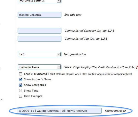
For example, I customized the footer message of the WUL mobile version with the © symbol instead of just text.
(And I did this in a very bootstrappy kinda way too.
I opened a Word document, inserted the symbol, and then pasted it into the WPTouch settings.)
2. Use a custom icon.
One of the things that’s very cool about WPTouch is that it has a nice selection of icons for you to use, that will show up in the mobile interface.
The default looks like a little notepad.
“Hmm,” I thought to myself.
“I have a favicon for WUL. How can I have that show up instead of the default icon?”
It’s really simple.
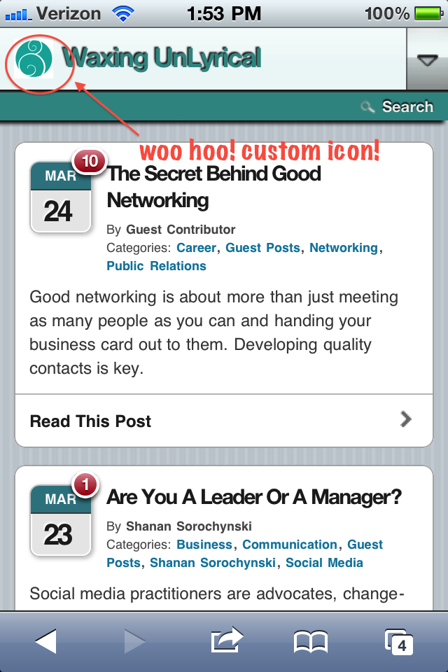
Assuming you already have a favorite icon, simply upload it to the Default and Custom Icon Pool in WPTouch’s settings (this will be below the Style & Color Options).
Save your settings, and then scroll down WPTouch’s settings page to the next set of options, which lets you set the logo icon, as well as menu items and icons for pages.
You should see your icon show up, and then select that.
See how neat that looks now, on the mobile version of WUL?
 3. Customize your color palette.
This might seem a little back-asswards, but the reason I did it this way was so that I could ensure that the title text, header and sub-header background colors stayed within the WUL color family, so to speak.
And the best way for me to do that was to see how they looked once the custom icon was installed.
Now, you won’t have many options when it comes to customizing the actual background itself, but I don’t think that matters much.
All that you have to do, to customize the title text and so on colors is to replace the default hex color codes in the Style & Color Options section with the ones you want.
I found WPTouch’s interface for replacing the hex codes weird – it wouldn’t work for me.
So instead, I used this hex color code chart and generator from 2 Create a Website, and replaced WPTouch’s defaults with my selections (make sure you don’t double the # that goes before).
So now, when you read WUL on your mobile device (and you do, don’t you?) its branding is somewhat consistent with the “real” deal.
And you can see how neat and clean posts look on my iPhone.
There you go!
A really easy way to make your WordPress blog mobile friendly.
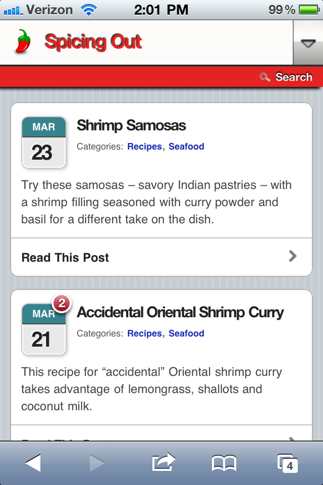
(And I did all this for my new foodie blog, Spicing Out as well, by the way, as you can see from the very first image in this post. If you love food, you should subscribe… heh!)
Was this helpful? Please let me know.
What other tips do you have on optimizing content for mobile?






[…] yet included this in a round-up of plugins, but this is an ab-fab plugin that literally makes your blog mobile-friendly in just a few steps. Since I’m linking to the earlier post I wrote on how easy it is to set it up, I won’t […]
This is clapsnslaps movies award 2014 please check this links for enjoing claps and slaps voting.
http://clapsnslaps.com/blog/clapsnslaps-movie-award-winners
http://clapsnslaps.com/blog/clapsnslaps-movie-award-winners-public
hi,
I installed the plugin, it seemed to work greatly but then when i
browsed from android, then the codes of the visual composer were visible
instead of the actual post.. :(
also i can’t select the latest post to be shown as landing page.. is there any solution?? i have deactivated it at this time..
Seema,
http://seemaye-web.com
Hi Happy CHristmas to you and all people i am very glad read about this blog i am sharing great information with you.
People can give opinions for http://www.clapsnslaps.com/movies/all, etc.
Hi very Nice Post i am read the article and get very good information from this post.
I am also sharing very good information about http://www.clapsnslaps.com/ is a one of the best social website for movies entertainment to rate and review on films by giving claps or slaps after that user becomes a critic of http://www.clapsnslaps.com/movies/all.
http://www.clapsnslaps.com/
http://www.clapsnslaps.com is a one of the best social website for movies entertainment to rate and review on films by giving claps or slaps after that user becomes a critic of bollywood and hollywood movies.
[…] experience too. Whip out your smartphone and look at your site. Is it fugly? Do something about it! Here’s a handy post from Shonali Burke if you’re running […]
Great post. Thanks alot! I think i’ll make mine mobile friendly now!
@ShakirahDawud @EricaAllison My pleasure! i figure there are enough of us non-techies out there that this kind of post will be helpful to… at least, that’s my goal!
Just getting around to this, and there is so much gratitude inside now that I have, lol! Thanks, I’m gonna go on in there and get WPTouch up and running tonight, and I’ll be back to customize later. As @EricaAllison said, thanks for doing the legwork I should have!
Great article. Thanks!
@Shonali Hahah you’re too funny! Well this little grasshopper appreciates your wisdom so far ;)
@rachaelseda I’m so glad it was useful – but be careful, you’re going to make me feel like a guru, which I’m not, just an aging grasshopper, LOL!
Thanks for this post. Your posts on WordPress are going to be very helpful as I begin to tackle setting up my own WordPress blog for the first time. Thanks!
[…] How to Make Your WordPress Blog Mobile Friendly – by Shonali Burke, waxingunlyrical.com […]
[…] Tom pointed me to this after Friday’s post on making your blog mobile friendly. I love the way he laid the steps […]
Test lindsay allen
@HowieSPM I think you need to develop a Sky Pulse Media mobile app. Eh @EricaAllison ?
@EricaAllison Absolutely my pleasure – it was a great learning experience for me. That @HowieSPM sure gets around, doesn’t he?!
@EricaAllison even though I have zero business YET my focus is actually mobile marketing strategies of various types. But I seem very contrarian to my Industry Colleagues who refuse to ask people what they want and think they can just track you down on your phone 24/7 and blast you with ads. Which really is spam.
I was in NYC recently and forgot my Shopkicker App was live on my phone. My Droid started buzzing off the hook. Alert Alert Alert. That wasn’t cool. I also have been observing when I do travel how useful/easy my phone is for things. Surprisingly still very primitive.
Shonali, this grasshopper thanks you! Thank you for taking the time to do the legwork that I should be doing and thanks for making it look so easy. You’re right, that @HowieSPM does seem to lead the charge on the mobile ‘movement’…glad he is! I think this is #3 in a series of ‘how-to’s’ from you that I’m putting into action! Thanks again!
@HowieSPM Literally as well as metaphorically speaking now, eh? :p Thank you for making me get off my butt and do this, Howie.
@justinthesouth Cool, I’m so glad it helped! I was getting lost and overwhelmed with the different options as well… that’s why I like WPTouch so much, it’s so simple. developsocially bradhuss
Hooray for Mobile Formatting Tools. Soon when people say we have our future right in our hands they may be right!
Thanks for the great how to! I just dealt with this at developsocially . Thanks to bradhuss for getting us taken care of because I got lost fast with all the different options!